

Choosing the Right Garment Blank: Fabric, Weight, and Fit
Artwork gets the attention, but the blank underneath decides how the print reads, how the craft behaves, and whether the finished garment feels like the brand you described.
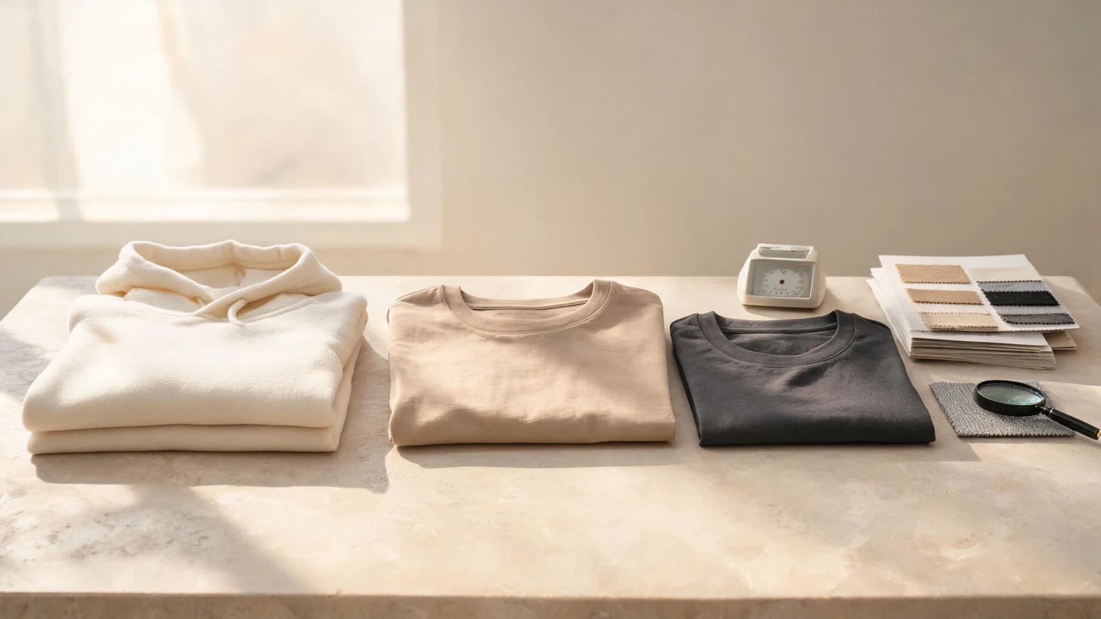
Most custom apparel projects begin with a design. The blank underneath it is treated as a container—something to be chosen quickly so the interesting work can start.
That order is backwards. The base garment decides how much ink or thread the surface can carry, how a texture sits after washing, how the color of the artwork shifts, and how the piece feels in someone's hands. Two identical designs on two different blanks are two different products.
This guide covers the four properties that matter most—composition, weight, knit structure, and color—and how to express them in a request, whether you start from a catalog product or from Free Customization.
Composition sets the ceiling
Fiber content is the first constraint, not a preference.
- Cotton takes water-based and discharge-style printing well and holds embroidery stitches with a stable base. It also shrinks, creases, and fades more visibly over time.
- Cotton-polyester blends resist shrinkage and hold shape through repeated washing. Higher polyester content can complicate certain print methods and heat settings.
- Tri-blends and rayon-rich knits drape softly and read as premium on the body, but the surface is less stable for fine detail and dense coverage.
- Fleece and loop-back terry give weight and structure, which suits raised textures and larger placements, but tends to swallow thin lines.
If a specific method is already decided, choose the composition that supports it. Read Apparel Decoration Techniques alongside this article—craft and blank are one decision made twice.
Weight tells you what the garment will feel like
Fabric weight is usually expressed in grams per square metre. It is the fastest proxy for how a garment will be perceived.
- Light knits feel airy and drape close to the body; they show print texture through the fabric more easily.
- Mid-weight knits are the common default for tees—enough opacity for most artwork, enough structure to hold a shape.
- Heavy knits and fleece read as substantial and are easier to justify at a higher retail price, but they cost more, ship heavier, and change what a placement looks like at scale.
Weight is not a quality score. A heavy blank chosen for the wrong product is simply a hot, expensive garment. Match weight to the season, the category, and the price position you are building toward.
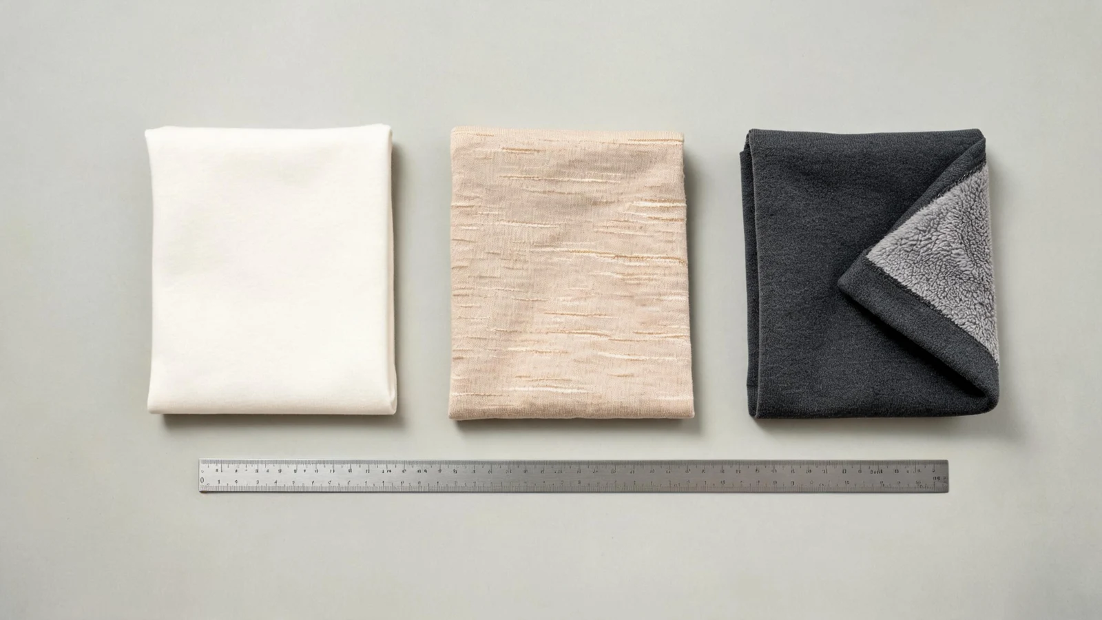
Knit structure decides how much detail survives
Two fabrics can share composition and weight and still behave differently, because the surface is built differently.
A smooth, fine-gauge jersey is the most forgiving surface for detailed artwork, small text, and precise registration. A slub or textured knit adds character to the blank itself, but the irregular surface interrupts thin lines and fine gradients. Brushed fleece and terry have depth and nap, which flatters raised and stitched effects while blurring delicate detail.
The practical rule: the more character the fabric has, the simpler the artwork should be. If you are committed to an intricate design, spend your character budget on the garment silhouette instead of the fabric surface.
Garment color changes how artwork must be built
A design is not color-independent. On a light blank, artwork can sit directly on the fabric and keep its intended tones. On a dark blank, most methods need an opaque foundation to prevent the base color from showing through, which affects hand feel, cost, and how bright the final colors read.
Tonal designs—artwork close in value to the garment—look refined but leave very little room for error. Preview them carefully before committing.
Color also interacts with fiber. The same dye recipe lands differently on cotton, on a blend, and on a brushed surface, and screen color is never a promise of production color. Preparing artwork properly is what keeps this manageable.
Fit and size range are part of the request
A blank is not one object; it is a set of variants. Catalog products carry their variants as SKU attributes such as size and color, and the variant you select is what the request and the eventual order are built on.
Before you commit, decide:
- Which sizes the design actually works on—a large placement scaled across a full size range does not read the same on every body.
- Whether the fit is intended to be regular, relaxed, or oversized, since the same measurement chart can be described several ways.
- Which colorways you genuinely need, rather than every color the blank happens to offer.
In a custom brief, the category, quality level, and expected price already communicate a lot. Use the notes and feature tags to state the fabric requirements you actually care about—composition, weight range, hand feel, fit—instead of assuming they are implied.
Confirm the blank before you scale the design
The cheapest moment to change a blank is before the artwork is finalized and the quantity is set. Once a request is quoted and accepted, the accepted scope is the agreed work.
So do the boring checks first: confirm the composition and weight, look at the variant list, and be explicit about what is a requirement versus a preference. If the garment feel is central to the product, ask about a sample before the full run rather than after it.
Great custom apparel is rarely the result of a better print. It is usually the result of a better decision about what the print was placed on. Start from a catalog product when the blank already matches, or describe the blank you need through Free Customization.
Frequently asked questions
- Does a heavier fabric always mean better quality?
- No. Weight signals how substantial a garment feels, not how well it is made. A heavy blank chosen for the wrong season or category is simply a hot, expensive garment. Match weight to the product and the price position you are building toward.
- Can I print fine detail on a textured or slub fabric?
- You can, but the irregular surface interrupts thin lines and fine gradients. The more character the fabric has, the simpler the artwork should be. If the design is intricate, choose a smooth fine-gauge jersey and put the character into the garment silhouette instead.
- Why does printing on a dark garment cost more?
- Most decoration methods need an opaque foundation layer on a dark base so the garment color does not show through the artwork. That extra layer affects hand feel, production time, and how bright the final colors read.