

How to Prepare Artwork for Better Custom Print Results
Prepare cleaner artwork, preserve useful detail, and organize reusable print assets before placing a design on custom apparel.
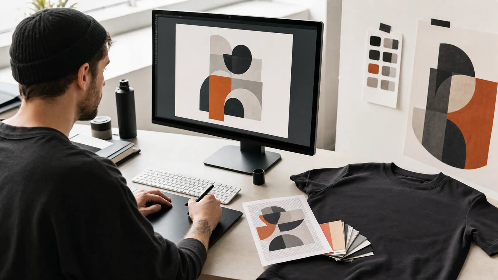
A strong print result begins before the artwork enters the garment editor. Placement tools and previews can help you evaluate a design, but they cannot restore detail that is missing from the source or decide which accidental background pixels belong in the final print.
A few minutes of preparation makes the design easier to place, easier to preview, and easier for production teams to interpret.
Start with the cleanest source available
Use the original artwork export whenever possible. Images copied from social media, screenshots, and files repeatedly compressed by messaging apps often contain soft edges, artifacts, or limited resolution.
Inspect the design at a larger viewing size. Look for:
- Jagged or fuzzy boundaries around shapes.
- Unwanted backgrounds or halos.
- Tiny isolated marks that are not part of the design.
- Fine lines that disappear when the artwork is reduced.
- Gradients or shadows that may not suit the chosen craft.
The right level of detail depends on the decoration method. A digital image and an embroidered mark do not need the same construction.
Separate artwork from the garment mockup
A photo of a shirt with a logo already placed on it is useful as a reference, but it is not the same as a reusable print source. Whenever possible, keep the artwork itself separate from product or lifestyle imagery.
The print source should contain only the visual that needs to be applied. The garment surface image should show the garment area on which it will be placed. Keeping those roles separate gives you control over scale and placement.
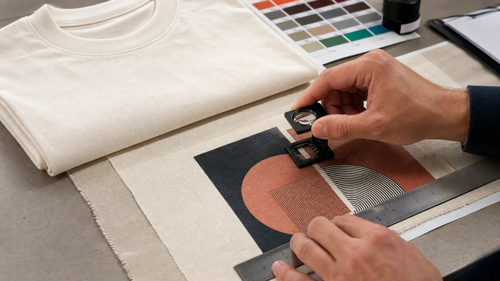
Design for the final size
A complex illustration may look excellent full-screen and become unreadable as a small chest mark. Before uploading, test the artwork at roughly the physical size you expect it to occupy.
Ask whether the primary shape remains recognizable, whether negative spaces stay open, and whether small text or thin lines still serve a purpose. Simplification is not a loss when it improves the real garment.
For large placements, check whether the composition can tolerate garment movement, folds, and seams. Keep critical details away from boundaries that may shift or distort.
Plan color with material in mind
Screen color is emitted light; garment color and print materials are physical. The fabric underneath a print, the ink or thread, and the selected finish can all influence the result.
Build contrast deliberately. A subtle tonal mark may be elegant, but it should be an intentional choice rather than the result of insufficient separation between artwork and garment. Metallic, reflective, flocked, puff, and stitched treatments also respond to light differently from flat digital color.
AI craft previews can help explore a direction, but exact color and material behavior must still be verified through the quote and production process.
Use the Print Library as a source of truth
When you upload a design through supported Labelix flows, it can be recorded in your Print Library. The library lets you reuse an owned source across requests and keeps generated effects grouped with the original design.
Use clear names that help you distinguish real variants. Instead of keeping several files all called “final,” name them by the meaningful difference: primary mark, light-garment version, dark-garment version, or simplified embroidery version.
Do not create duplicate uploads when the underlying source is identical. Reusing the saved print keeps the relationship between the source and its effects easier to understand.
Check placement after upload
Once the artwork is attached to a surface:
- Set the approximate position and scale.
- Check whether it crosses seams or garment edges.
- Review its relationship to other prints on the same surface.
- Generate a craft effect when that option is useful.
- Revisit scale after viewing the composed surface or try-on preview.
A technically clean file can still be placed poorly. Treat source preparation and garment composition as two separate quality checks.
Prepare the artwork first, then browse products or begin a Free Customization request.
Frequently asked questions
- Can I use a photo of a garment with the logo already on it as my print file?
- No. That image is a useful reference but not a reusable print source. The print source should contain only the visual to be applied, and the surface image should show the garment area it goes on. Keeping the two roles separate is what gives you control over scale and placement.
- Is a screenshot or a social-media download good enough for printing?
- Rarely. Files copied from social platforms or passed through messaging apps are repeatedly compressed, which leaves soft edges, artifacts, and limited resolution. Placement tools cannot restore detail the source never had, so start from the original export whenever it exists.
- How do I know if my artwork is too detailed for a small placement?
- Test it at roughly the physical size it will occupy before uploading. Check whether the primary shape stays recognizable, whether negative spaces stay open, and whether thin lines or small text still serve a purpose. Simplifying for the real size is an improvement, not a loss.